
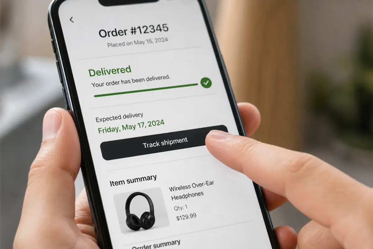
An order page is not just a receipt. It is the place customers visit when they need reassurance, a delivery answer, or a way to fix a problem. Reviewing a well-designed order details page can help teams spot useful layout patterns, but the goal is not to copy a visual style. The goal is to help customers understand their specific order immediately.
After checkout, customers should not have to search through emails, carrier sites, or support articles to learn what happened. A strong order detail page answers the most urgent question first, then gives the customer a clear next step if the answer is not good news.
Why Order Detail Pages Matter After Checkout
The purchase journey continues after payment. Customers may return minutes later to confirm that an order was accepted, then return again to check delivery progress or start a return. In research on order-tracking UX, Baymard reports that 50% of surveyed respondents considered order tracking the most important account feature. That makes this page a core self-service tool, not a secondary account screen.
Keep the roles clear. The confirmation page acknowledges a completed purchase. Order history lists past purchases. The order detail page provides the complete, current record for one order, including status, delivery, payment, items, and relevant actions.
The Questions Users Want Answered
Most people arrive with one question, not a desire to explore the interface. Before choosing components or arranging database fields, list the answers customers need:
- What did I buy, and how many items are included?
- How much was I charged, and which payment method was used?
- Was the order accepted, shipped, delivered, delayed, or canceled?
- When should it arrive, and where is it now?
- Can I change the address, cancel, return an item, or report a problem?
- Who can help if the order requires attention?
Build A Clear Information Hierarchy
Place the most time-sensitive information at the top. A useful sequence is current status, expected delivery date, order number, and purchase date, item summary, shipment details, payment breakdown, and then secondary actions. Put product names, selected options, quantities, and prices beside each line item so customers can verify the purchase without opening another screen.
Visual weight should match urgency. A delayed package, failed payment, or required customer action should be more prominent than a routine billing label. Avoid making the order number the largest element when customers are far more likely to be looking for a delivery date.
Make Status And Delivery Progress Easy To Read
Use familiar status labels such as Confirmed, Processing, Shipped, Out for Delivery, Delivered, and Delayed. Pair each one with a brief explanation, the latest update time when available, and a realistic delivery expectation. A timeline is helpful for multi-step fulfillment, partial shipments, or scheduled services.
Write Status Messages That Explain The Next Step
Weak: Shipment exception
Clearer: Delivery is delayed because the carrier could not access the address. Review the address or contact support for help.
Customers track orders for anticipation, reassurance, and coordination. Therefore, a generic message is rarely enough. If tracking data is incomplete, say what is known, when the next update is expected, and what the customer can do now.
Present Payment And Order Summaries Clearly
Show the subtotal, discounts, shipping, taxes, and final total in a scannable breakdown. Keep each currency symbol beside its amount, label refunds and store credits plainly, and distinguish completed, pending, declined, and under-review payments. Receipts and invoices should be easy to find, especially for business purchases and reimbursements.
If a customer could mistake a pending authorization for a completed charge, the page needs clearer wording and stronger visual contrast. Consistent date and time formats also reduce confusion when orders, refunds, and delivery events occur close together.
Place Useful Actions Where Users Expect Them
Keep “Track Package,” “Download Receipt,” and “Contact Support” visible near the information they affect. Put return options near the relevant item, not only in a general menu. Explain what happens after a customer submits an address change, cancellation request, or refund request.
- Show frequent, urgent actions in the main view.
- Use confirmation dialogs for destructive or financially significant actions.
- Do not bury time-sensitive tasks inside a crowded overflow menu.
- Give cancellation and refund controls less casual visual treatment than routine downloads.
Design For Mobile And Accessibility
Order management often happens on a phone, sometimes on a slow connection. Use a single-column layout on narrow screens, let long addresses and tracking numbers wrap, and provide tap targets that do not require precision. Status should use text and icons, not color alone.
Good web accessibility practices also make this page more reliable for everyone. Support keyboard navigation and screen readers, provide useful alternative text for product images, maintain readable contrast, and preserve essential order information if images or live carrier data fail to load.
Protect Personal And Order Information
Order pages contain addresses, phone numbers, payment details, and sometimes private delivery notes. Limit what appears on shared devices, page titles, URLs, and notifications. Require authentication or an appropriate verification step before exposing sensitive details, and explain why that extra step is necessary.
A shareable delivery link can be useful for a household member, but it should reveal only the shipment details required for delivery coordination. It should not expose billing information, full payment data, or private account notes.
Test The Page With Real User Tasks
Test the page with realistic scenarios before launch. Ask participants to find the delivery date, identify the amount charged, locate tracking, start a return, and explain the current status in their own words. Repeat the tests on mobile devices and with assistive technology.
Measure task completion, time to find the delivery date or receipt, clicks on tracking and help actions, support contacts about order status, and errors during cancellations, returns, or address changes. These signals reveal whether the page answers questions or merely displays data.
Common Order Detail Page Mistakes
- Using vague labels such as “processing issue” or “carrier exception.”
- Sending customers to a carrier site before showing basic delivery details.
- Failing to explain partial shipments, delays, and empty tracking states.
- Using color as the only status indicator.
- Putting promotions above the customer’s main order question.
- Designing for desktop first and treating mobile as an afterthought.
Final Checklist
- Can customers identify the current status and expected delivery date immediately?
- Are item, payment, and delivery details grouped logically?
- Are common actions visible and destructive actions protected?
- Does every problem message explain the next step?
- Does the page work on mobile, with a keyboard, and with a screen reader?
- Is sensitive order information appropriately protected?
A successful order detail page does not impress customers with complexity. It gives the right answer in the right place, then makes the next action obvious.
Also Read-Common Business Challenges and How to Overcome Them

Add a Comment