
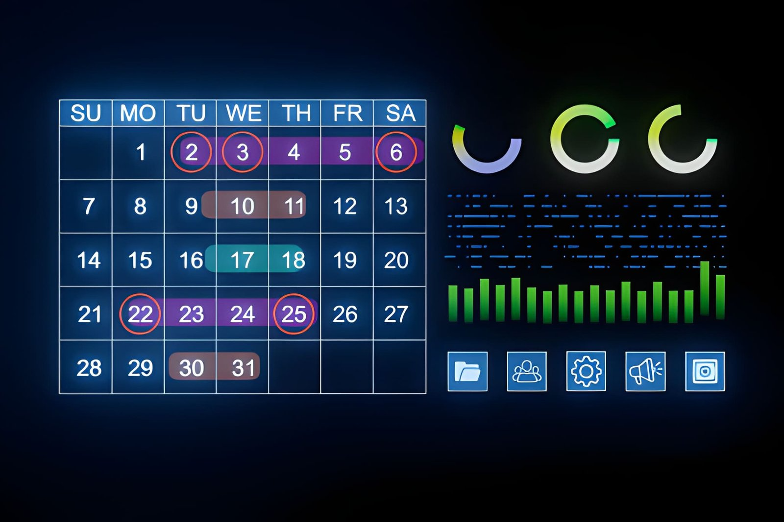
In the digital era, where seamless interactions and user satisfaction are pivotal for success, interface elements like date pickers can make or break the user experience. When users need to enter or select dates, a thoughtfully designed date picker alleviates frustration and minimizes mistakes. A robust date selector UI not only streamlines processes such as booking appointments, creating reminders, and tracking progress, but it also enhances the overall flow of an application.
Modern digital products are judged by how easily and reliably users can achieve their goals. When date selection feels effortless, people are more likely to complete tasks, resulting in improved engagement and conversion rates. As digital journeys span larger screens and mobile devices alike, small interaction details like date pickers play an outsized role in building trust and loyalty between users and applications.
Incorporating smart interface elements not only reduces cognitive load and input errors but also shapes how people perceive the brand’s professionalism and accessibility. The right approach to date picker design considers the context of use, anticipates user needs, and seamlessly adapts to different platforms. These factors, when combined, can significantly affect whether visitors stay, return, or recommend the service to others.
According to the Baymard Institute, user expectations in booking and scheduling interfaces are higher when date entry is involved, which is why the mechanics of displaying, selecting, and confirming dates require special attention. A poor date selection process can result in abandoned sessions, but when executed well, it can be a distinguishing feature of the user experience.
Importance of Date Pickers in UI Design
Date pickers are essential tools in a wide range of applications. From booking hotels and flights to tracking goals and setting reminders, they replace manual typing and ensure consistent formatting. Selecting dates with a visual tool speeds up workflows and reduces the risk of input errors, making the experience smoother for users of all skill levels. Clear, easy-to-use date pickers help with both simple and more complex tasks like filtering data by date in dashboards or reporting tools.
Dates are often mission-critical inputs, such as when making purchases, managing schedules, or planning travel. Research from Nielsen Norman Group indicates that minimizing data entry friction significantly influences user satisfaction and conversion rates. When a date picker aligns with localized date formats and disables unavailable options, it reduces user anxiety and builds confidence in the process.
Best Practices for Designing Date Pickers
Effective date pickers balance visual clarity, functional flexibility, and error prevention. Following these best practices will help designers create tools that resonate with diverse user groups:
- Provide Clear Format Guidance: Using placeholder text or subtle hints clarifies the expected input. For example, “MM/DD/YYYY” or “Select a date” communicates expectations, minimizing confusion about formats.
- Highlight Current and Selected Dates: Emphasizing the present day and the chosen date with color or bold text provides immediate visual feedback, speeding up the process and reducing mistakes.
- Block Unavailable Dates: Disabling past or restricted dates prevents invalid selections and unnecessary errors. Users see only valid choices, making the picker easier to navigate.
- Support Quick Entry Options: For recurring scenarios, such as selecting today or tomorrow, offer quick-select buttons or shortcuts.
Incorporate adaptive elements so that users adjusting the picker from various devices enjoy a consistent, frustration-free experience.
Accessibility Considerations
All users, including those with disabilities, should be able to use date pickers easily. Compliant design involves clearly labeling input fields, making every element keyboard-accessible, and ensuring compatibility with screen readers. Leveraging the W3C ARIA date picker dialog pattern provides guidance on the necessary roles and properties. Accessibility features not only support inclusivity but also broaden the potential audience and foster brand loyalty.
Accessible date pickers provide alternate text for icons, a logical tab order, and error notifications that can be understood without color alone. Testing with accessibility tools can reveal areas for improvement, ensuring everyone can engage with the content equally.
Mobile Optimization
As most users interact with applications on their phones, it is crucial to optimize date pickers for small screens. Larger interactive elements, gesture support, and minimal typing contribute to a pleasant mobile experience. Whenever possible, use native pickers provided by mobile operating systems, as they are already optimized for touch and familiar to users.
Ensure that the picker adapts to changing orientations and device types, remaining easy to read and interact with at all times. Prioritizing responsive design principles and reducing unnecessary clutter go a long way toward improving usability on mobile devices, as recommended by resources like UX Design.
Handling Date Ranges Effectively
Many scenarios require users to select a date range, such as hotel reservations or rental periods. Displaying start and end date fields within a unified view prevents context switching and confusion. Highlighting the selected range with a connected background visually links the two dates, making the selection process more intuitive. Offering common presets like “this week” or “last month” expedites the experience, especially for repetitive tasks.
Allowing users to easily modify or clear selections further reduces friction. Clearly communicate restrictions or rules, such as minimum or maximum durations, to prevent mistakes and unnecessary retries.
Conclusion
Thoughtful date picker design can transform a cumbersome step into a highlight of a digital journey. By adhering to best practices, addressing accessibility, and embracing mobile optimization, designers create engaging and efficient date pickers that are easy for everyone to use. Prioritizing usability and context results in fewer abandoned tasks and greater user satisfaction, making well-designed date pickers valuable assets across all digital experiences.
Read more: From Links to Leads: Crafting Credible Backlinks –
Wake Up to Ocean Views: Why Surf City NC Rentals Are Worth It –

Add a Comment